Your association website acts as both the first impression of your organization as well as its primary point of contact for current and prospective members. In terms of enabling your organization to achieve its goals, redesigning your website is a high-stakes undertaking.
As you plan for your new website, you may struggle to articulate exactly what elements transform an association website from merely good to truly great. To provide some inspiration, we’ve surveyed the field of member-focused organizations in search of examples of impressive website design. Though each of the websites we’ve chosen has a distinctive focus, all three share a similar trait: Each one is built from strategic decisions that enhance their message and enable them to form a stronger connection with their members. But first: What makes these websites so successful?
Keys to a Cohesive Association Website
A truly effective website doesn’t just tell your story – it communicates who you are and who you serve. By bringing the following elements into alignment, you create a cohesive user experience that resonates with your audience and reinforces your brand identity.

Content: Confirming Your Brand Identity
Your website’s content should provide proof of your value. From the hero image on your homepage to your resources section, every component should work together to communicate who you are and what you stand for.

Navigation: Expressing Organizational Priorities
The elements of a website’s navigation function as a reflection of what matters most to your association. The terms chosen and how they are organized communicate your priorities to your members and search engines.

Design: Delivering Your Association’s Message
Cohesive design strengthens your messaging by creating a seamless user experience. Every design choice should support your brand identity and engage your audience. A well-designed site organizes information effectively, instilling confidence in users that they’re in the right place.
3 Examples of Successful Association Websites
An effective website does much more than inform your users. It’s a powerful tool for member retention and recruitment that communicates your organization’s story and delivers on the value of membership.
We should note one important caveat. Evaluating a website’s effectiveness requires an understanding of how well it’s designed, built, and maintained to meet specific goals, serve particular audiences, and address unique needs.
Since we didn’t design or create the websites reviewed here, we don’t have insight into the objectives or strategies behind them. However, by drawing on our design expertise and analyzing the visible content, we’ve highlighted these standouts to offer valuable inspiration. Additionally, we’ve suggested areas for improvement, recognizing that every website has room to grow.
1. American Institute of Architects (AIA)
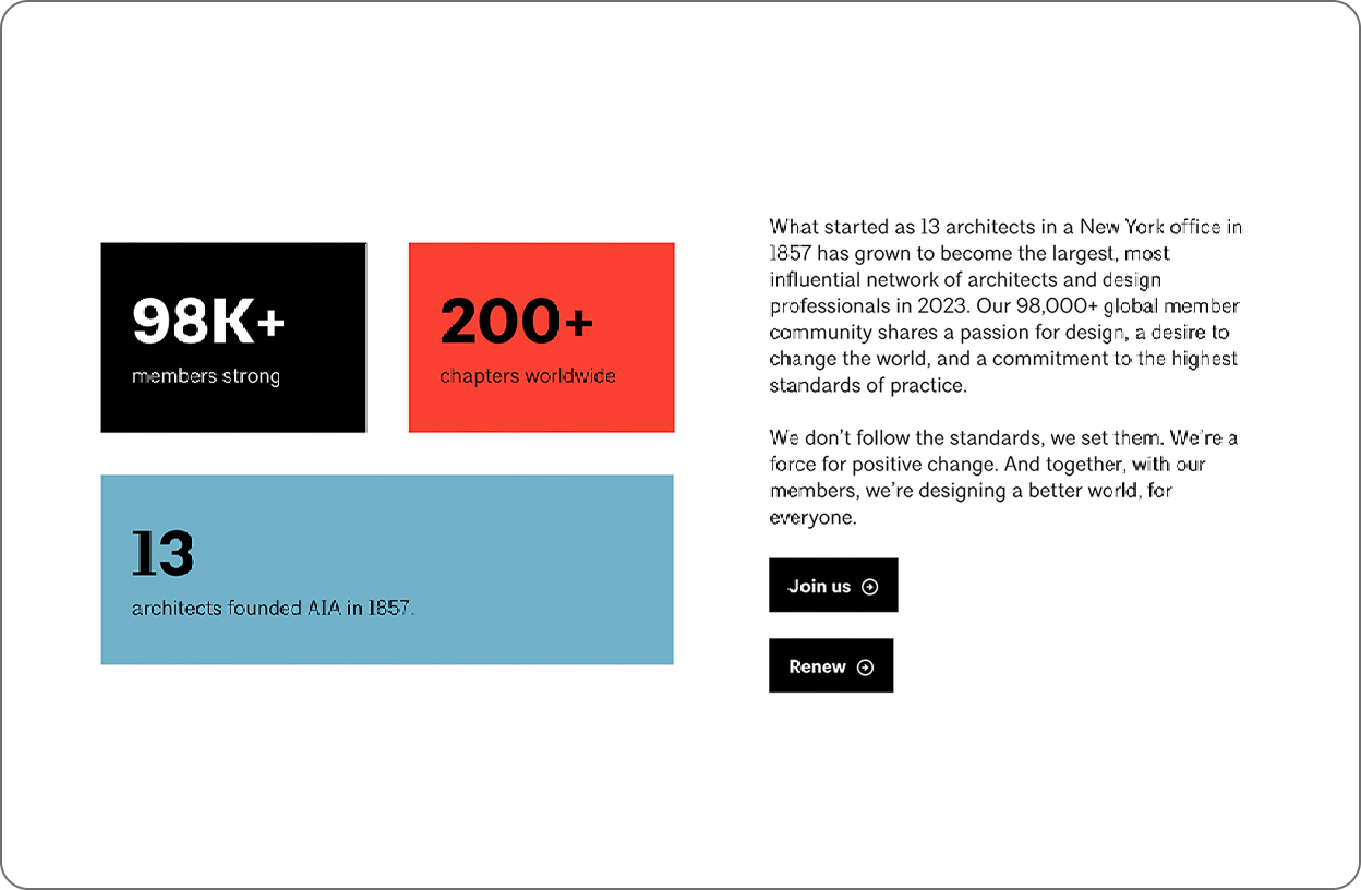
AIA offers a sleek, hardworking website that feels effortless. With its minimalist design and clean grids, it speaks directly to architects. The layout balances compelling marketing and valuable content, all working seamlessly together. Every element is thoughtfully crafted to showcase the value of membership, engage members with useful resources, and effectively represent the industry and organization. AIA doesn’t just tell you who they are—their website shows you.

Confirming Brand Identity Through Content
Potential members need to understand who you are and what you offer in the first few moments on your website. Below the hero video, a bold statement succinctly explains the organization’s identity. This aspirational expression of a shared belief frames who should be a member and sets a tone of belonging. Just below, we get a few proof points in the form of the latest news and featured projects. These elements provide clear examples of how AIA is translating their words into action and real-world results.

Back Up Your Claims With Proof
The headline “Build knowledge with exclusive resources” proposes a value proposition, and then six resources serve as proof points to those considering membership.

Navigation That Communicates Priorities
AIA’s collapsed navigation menu speaks volumes about what’s most important to the organization. Short, punchy terms pack messaging into a small space, giving visitors a clear sense of what AIA is about without reading a single word of body copy.
One note for improvement: The navigation terms in the collapsed menu are effective, but the overall navigation at the top of the website has too many items competing for attention. The user isn’t sure where to go first.

Leveraging Design for the Right First Impression
In a world full of distractions and short attention spans, your website design plays a crucial role in capturing attention and keeping users engaged. AIA’s homepage is well-organized, with a clean, minimal design that uses whitespace effectively to highlight key elements. The content transitions smoothly between various formats and sizes, creating a rhythm that keeps users interested.

Build Trust Through Consistency
The website’s interior pages smartly use a modular design system to create unique pages. Designing with a core set of components ensures a consistent experience that is more efficient for users to navigate. Just as importantly, it adds to the perception of professionalism and trust in the organization.

Align Your Imagery to Your Values and Goals
AIA also uses high-quality imagery throughout the website to show the association’s diverse range of members and portray them in a professional way. Each photo serves to humanize the organization and elevate the members and their industry.
2. Motion Pictures Association
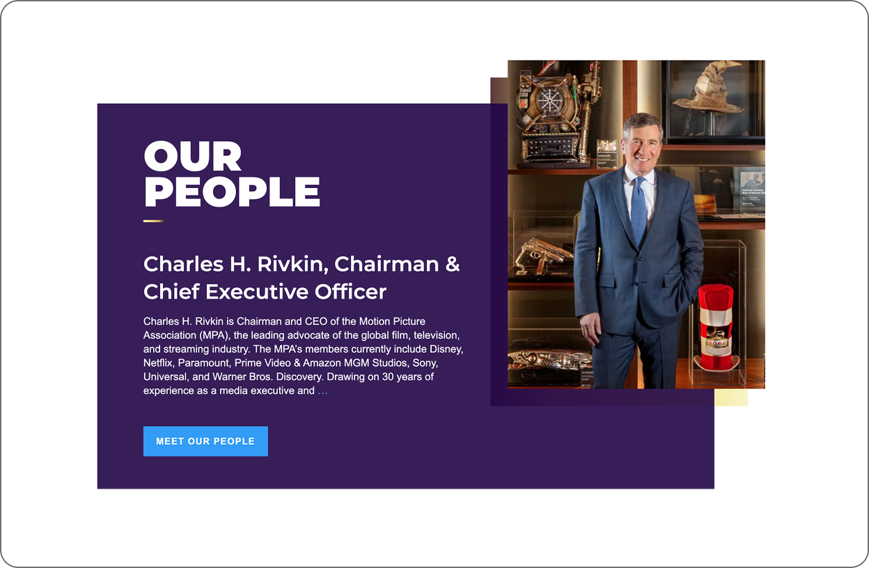
The Motion Picture Association’s website effectively captures the essence of the film, television, and streaming industry around the world while clearly communicating its mission. Strong visuals, focused content, and a clean design engage members and reflect the organization’s professionalism. This simple website delivers an immersive and streamlined experience.

On-Brand Content Strategy
When users visit the Motion Picture Association’s website, they’re instantly immersed in the world of cinema. The site seamlessly blends organizational messaging with timely, relevant content to create a captivating experience. High-quality video from iconic Hollywood films, paired with concise, impactful copy, reflects the organization’s identity while clearly communicating its mission.

Focused Content Delivers a Digestible Message
With only five major sections on the homepage, the Motion Pictures Association achieves a delicate balance. The site is visually captivating without becoming overwhelming, allowing visitors to quickly grasp the association’s purpose and values.

Leveraging Design Best Practices to Compete for Attention
Dynamic layouts marked by rich imagery keep users engaged as they explore the content. The consistent use of white space and a limited color palette provides added energy and focus, guiding visitors’ attention to key information.

Professionalism Through Consistency
A cohesive design approach (typography treatments, color palette and layout compositions) creates a reliable and trustworthy experience for users, reinforcing the association’s professional image as they navigate to different sections.

Suggestions for Improvement
However, MPA’s website still needs improvement. Reorganizing the main navigation down to four to six navigation terms will be less overwhelming to the user and will clearly communicate the organization’s priorities.
3. Entomological Society of America (ESA)
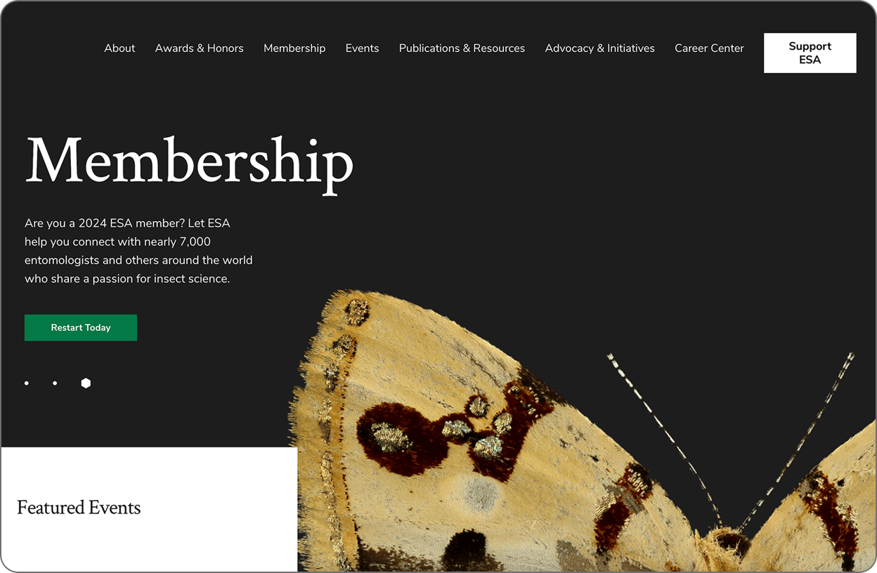
The Entomological Society of America’s website is dynamic and engaging. It showcases entomology through vibrant visuals while providing essential professional resources. The site effectively functions as both a member recruitment tool and an educational resource, reflecting the organization’s commitment to serving the professional and scientific needs of entomologists.

Standout Images and Balanced Messaging
With bold, contrasting colors and standout imagery, ESA declares that this isn’t your grandfather’s bug club. By prominently featuring what its members are passionate about, ESA transforms a niche subject into a powerful design asset.

Maximizing the Impact of Photos
Oversized insect imagery immediately draws the eye, along with professional photos of members in action. The pages artfully blend the association’s focus with the human element of membership. Plus, the design shows a good understanding of how people use websites, scanning and then engaging if they find something interesting.

Depth of Design Elements Maintains Engagement
Consistent use of three image types — close-up nature textures, dramatic bug close-ups, and high-quality member photos — is on message and gives the marketing team a wide variety of assets to work with.

Belonging Through Imagery
Crucially, ESA avoids the pitfall of relying solely on insect imagery. The inclusion of diverse, high-quality photos of members strikes a smart balance, reminding visitors that while bugs are the passion, people are the heart of this organization. This approach not only engages current members but also helps new members envision themselves as part of the ESA community.

Strategic Design Choices
Large, impactful images paired with concise copy blocks in generous font sizes cater to modern web browsing habits, allowing users to scan and engage with content quickly. Dynamic imagery punctuates key calls to action, guiding visitors toward important information and interactions.

Navigation Leaves Room for Improvement
The ESA website excels at communicating its focus and connecting with members, but its navigation structure still needs attention. The terms are standard for associations, but they could be more effective at communicating ESA’s unique identity and priorities. A more streamlined, distinctive navigation could further enhance the website experience.
Crafting a Website That Elevates Your Association
A great website isn’t just a digital brochure. It’s a powerful communication tool for expressing your value and delivering member benefits.
Creating a website that truly resonates with your members and expresses your association’s story goes beyond aesthetics. It’s about strategically aligning your content, navigation, and design to deliver a cohesive message that speaks directly to your audience.
By understanding which strategies work well (and a few that don’t), you’ll be better prepared for your next website project, one that serves your current members while attracting and inspiring the next generation. If this kind of website redesign will benefit your association, we’d love to help you get started.


